


Emojis have become integral to digital communication over messaging apps and social media platforms. Over 10 billion emojis are being sent each and every day, with 95% of internet users having sent an emoji at some point in time. While both Apple and Android offer a wide range of emojis, there are significant differences in the way they are designed and presented. In this article, we will take a closer look at how different emojis are on iPhone and Android.
What are emojis?
Emojis are those small icons—smiley faces, winking eyes, hearts of all shapes, sizes and colors—that we use in text messages, emails and social media. They are everywhere these days because they increase the precision and nuance of our often super-brief and open-to-misunderstanding communications.
According to ExpressVPN’s research, over 96% of people in France, Germany, Spain, and the U.S. use emojis regularly when communicating. These small, expressive icons have the power to convey emotions, reactions, and even complex ideas with just a single tap.
Unicode, the organization that approves new emojis, has been creating new emoji on an annual basis recently. While both iOS and Android are improving the range of emojis available to users, what we’re still lacking are cross-platform pictures that look the same on any device.
The basic emoji symbols are actually the same on iOS and Android, but Apple, Google and Samsung designers create different looks for each icon. Confusingly, the companies also add emoji support at different times.
The Evolution of Emoji Design: A Brief History
Emoji first originated in Japan in the late 1990s, and by the early 2000s, they had become a popular form of communication in the country. However, it wasn’t until the release of iPhone in 2007 that emojis started to gain global popularity. Apple’s decision to include an emoji keyboard on its devices was a game-changer, and soon, other smartphone manufacturers followed suit.
Over the years, emoji design has evolved significantly. In the early days, emojis were simple, pixelated designs that had limited color options. However, with advancements in technology, emoji design has become more complex, with more realistic and detailed designs. Today, emojis are available in a range of skin tones, and while different smartphone manufacturers have distinct emoji styles, emoji can translate across platforms, thanks to Unicode. This is why an iPhone user is able to receive the smiling pile of poo emoji from someone using a Samsung Galaxy.

Why are emojis different on iOS and android?
The reason behind the differences in iPhone and Android emojis lies in their design philosophy. Apple designs its emojis to have a consistent look and feel, with a focus on simplicity and clarity. On the other hand, Android emojis are designed to be more expressive and playful, with a greater emphasis on customization and personalization.
One factor that contributes to the differences is the software used to render the emojis. Apple uses a proprietary font called ”Apple Color Emoji” to render its emojis. This font is designed to work seamlessly across all Apple devices, ensuring a consistent experience for users. Android, on the other hand, uses the ”Roboto” font for its emojis, which is a standard font used across the Android platform.
Another factor is the cultural differences between the two companies. Apple is an American company, while Android is an open-source platform developed by Google, a multinational company with a global reach. This might explain why some emojis on an iPhone have a more Western-centric design, while on an Android device, they might have a more global appeal.
The last but not least reason why there’s an emoji gap between iPhone users and Android users is because Apple is great at getting its users to upgrade to the latest version of its software.
Android vendors, like Samsung or LG, aren’t as quick as Apple is to upgrade to the latest version of Android.
There are Android phones that get regular updates, most notably, Google’s own Pixel, which will get the latest Android update as soon as possible for at least a few years. But right now, most of the more popular Android phones, such as Samsung’s, don’t have that same promise.
Comparing Emoji Styles: iPhone vs Android
Apple has its own style for emoji on iOS and iPadOS, Google has its own style for Pixel phones, Samsung has its style for Galaxy phones, and so on. These companies want the emoji to blend in nicely with the overall look of their respective operating systems.
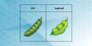
For example, a green-colored Pea Pod is among the newest emojis on iOS and Android. It illustrates a pea pod split open to reveal the peas inside. People use the Pea Pod emoji in a straightforward way, to refer to the vegetable, or as a statement of friendship. It can be used to explain recipes, and to express popular idioms like ‘two peas in a pod.
A tiny yet fun detail, which most people miss, is that the Pea Pod emoji has three peas on Android and five on iOS.
How Do iPhone and Android Handle Facial Expressions in Emojis?
Facial expressions are a crucial aspect of emojis, as they allow us to convey emotions through our messages. When it comes to facial expressions, there are significant differences between iPhone and Android emojis.
Let’s look at some examples.
First, the single-most used emoji on all platforms: Face with Tears of Joy. On iPhones and Pixel phones, the looks have closed eyes, a fully wide smile, and big tears that extend out of the face, while the Galaxy phones, the tears are much smaller.
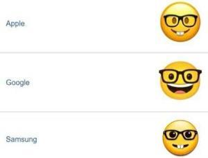
Next, let’s look at “Nerd Face” from the same three vendors. On iPhones and Galaxy phones, the emoji has a small smirk with glasses, while the same emoji on Pixel phones could be seen as laughing or smiling very big.
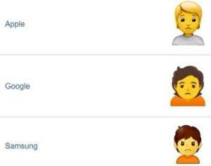
Another expression emoji is “Person Frowning.” On iPhones and Pixel phones, the emoji definitely appear to be sad, while the same emoji on Galaxy phones actually looks angrier than sad.
These are just a few examples of how emoji are different on iPhone and Android phone. iOS and Android skins look very different, so it makes sense they’d want to emoji to fit in. Thankfully, you can easily check what every emoji looks like on other platforms. Emojipedia shows what emoji look like from Apple, Google, Samsung, Microsoft, and a bunch of others.
We think it’s good for everyone to understand these things aren’t standardized, but we’re not expecting everyone to check what an emoji looks like on other platforms every time they send a message. That’s not realistic, and you shouldn’t have to do it.
Exploring Cultural Differences in Emoji Design on iPhone and Android
Emojis are a universal form of communication, but their design is not always universal. Different cultures have different ways of interpreting emojis, and this can lead to differences in design.
For example, the folded hands emoji, which is used to represent prayer or thanks, looks very different on iPhone and Android. On the iPhone, the hands are closer together, while on Android, the hands are further apart. This difference in design is due to the cultural differences in the way people pray in different parts of the world.
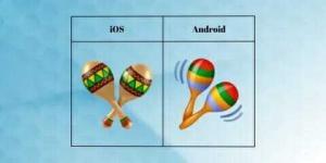
Similarly, the Maracas emoji looks different on iPhone and Android. A maraca is a percussion instrument. Per the emoji’s proposal submitted to Unicode, it can "symbolize a celebration or specific cultural holidays," particularly as a reference to Latin American culture. It’s meant to convey a feeling of joy and the music that’s an integral part of celebration. The Maracas emojis have a slightly different appearance on Android and iOS. While the former shows two Maracas instruments side by side with motion lines (red top), the latter shows static maracas, one over another.
The Impact of Updates: What to Expect from Future Emoji Designs on iOS and Android
The Unicode Consortium is continually approving and adding new graphics for use on Android, iOS, and other platforms. Both Apple and Android regularly update their emojis, adding new designs and features to keep up with the latest trends. In recent years, there has been a push for more inclusive emojis, with the introduction of emojis that represent people with disabilities and different skin tones.
In the future, we can expect to see even more diverse and inclusive emojis on both platforms. As technology continues to advance, we may even see the introduction of more interactive and animated emojis that allow us to express ourselves in even more creative ways.
Conclusion: Which Platform Has the Upper Hand in Emoji Design?
When it comes to emoji design, both iPhone and Android have their strengths and weaknesses. Apple focuses on simplicity and consistency, while Android focuses on personalization and customization. However, both platforms are constantly updating their emojis and adding new features, which means that the design differences are likely to become less pronounced over time.
Ultimately, the choice between iPhone and Android emojis comes down to personal preference. Some people may prefer the simpler and streamlined design of Apple’s emojis, while others may prefer the more realistic and detailed design of Android’s emojis. Regardless of which platform you choose, one thing is certain: emojis are here to stay, and they will continue to play an important role in our daily communication.